E.Photo

E.Photo

E.Photo is a small Headshot Photo Studio it was amazing working with them.

Client

E.Photo

Type

Web Design

Year

2026

Industries

Photography

Timeline

17 Days

Challenge

Challenge

E.Photo needed a digital presence that felt as expressive as the portraits they create.
The challenge was to showcase their headshot work through a bold, image-first experience while keeping navigation simple and making it easy for potential clients to explore their work and get in touch.

Design Goals

Design Goals

Portrait-first presentation

Editorial-inspired layouts

Simple project discovery

Clear contact journey

Responsive across devices

Portrait-first presentation

Editorial-inspired layouts

Simple project discoveryClear contact journey

Responsive across devices

Design Process

Design Process

Homepage

Homepage

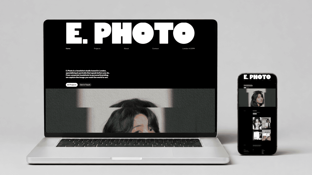
The homepage was designed to make the photography speak first.
Large portrait imagery, bold typography, and a minimal dark layout create an editorial feel while quickly introducing E.Photo's work and directing visitors toward their projects.

The homepage was designed to make the photography speak first.
Large portrait imagery, bold typography, and a minimal dark layout create an editorial feel while quickly introducing E.Photo's work and directing visitors toward their projects.

Project Section

Project Section

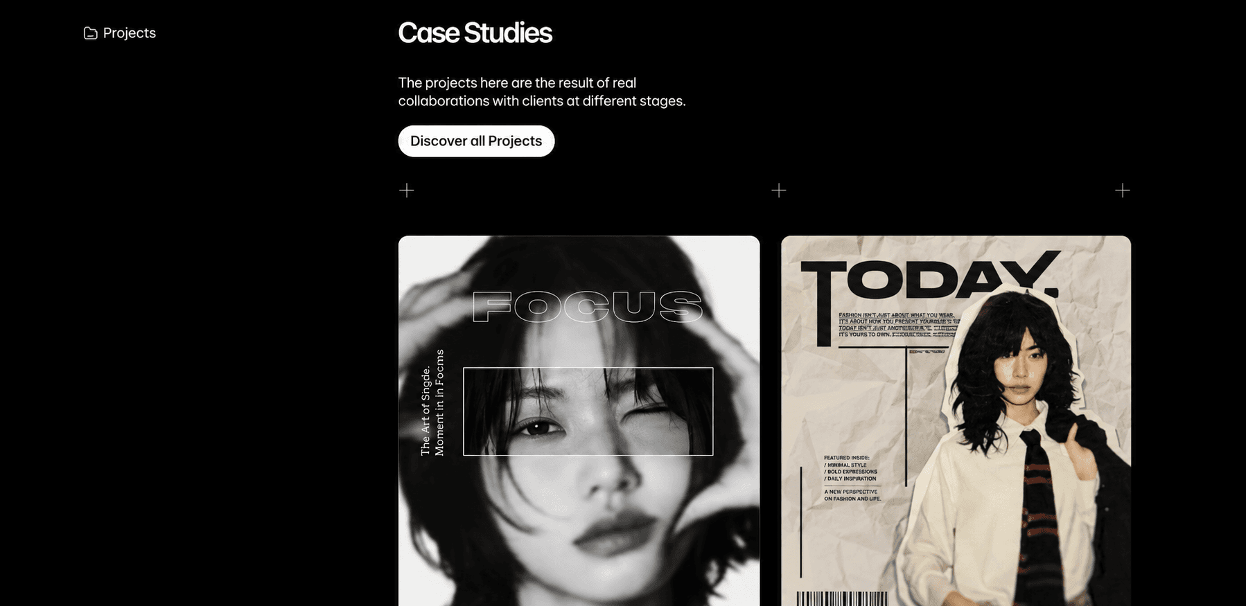
The project section was built to turn E.Photo's photography into a visual portfolio.
Selected shoots are presented as case studies, allowing visitors to explore different styles, compositions, and creative collaborations without overwhelming the experience.

The project section was built to turn E.Photo's photography into a visual portfolio.
Selected shoots are presented as case studies, allowing visitors to explore different styles, compositions, and creative collaborations without overwhelming the experience.

Mobile Experience

Mobile Experience

The experience was carefully adapted for smaller screens without losing its visual character.
Images, typography, navigation, and project layouts were reorganized for mobile so the photography remains the focus while browsing stays smooth and intuitive.

The experience was carefully adapted for smaller screens without losing its visual character.
Images, typography, navigation, and project layouts were reorganized for mobile so the photography remains the focus while browsing stays smooth and intuitive.

Client Feedback

Client Feedback

"LeeLuxeDigital understood the style we were going for and turned it into a website that feels clean, creative, and professional. We loved how the final site showcases our work without taking attention away from the photography."


"LeeLuxeDigital understood the style we were going for and turned it into a website that feels clean, creative, and professional. We loved how the final site showcases our work without taking attention away from the photography"

—-James,E.Photo

— James,E.Photo